Tuesday, June 29, 2010

How does your garden grow?

Last year I attempted to dig out a piece of our lawn to plant a vegetable garden. The little plot cost me a fortune after I put up a fence to keep the deer out, added more dirt for filler with rich fertilizers, and bought enough cages to strengthen all my tomato plants. The problem is...that my 13 tomato plants only produced 13 tomatoes. I sure could have gotten a better deal at the farmers market. But I enjoyed the experience and am planning to repeat it again this year. At least I won't have the initial costs of the fencing and dirt.

Why am I on this tirade? Because I have Veggiebella from Stamping Bella to show you...she's my motivation for the coming months. I'm hoping to have lots of fresh veggies to feast on!


I reused JodiBella's sketch from last week since I loved it so much. It sure makes life easy once the layout is decided for you. I stamped the image on Neenah Classic Crest solar white cardstock with Memento Tuxedo Black ink. I then colored her with copics but added shading with prismacolor pencils blended with gamsol. The background design paper came from Mary Maxim and is from Carol Wilson Fine Arts. The foreground design paper is from the Cosmo Cricket Garden Variety 6x6 pack. I love these packs - everything coordinates and it again cuts my decision time in half. Woot Woot!

The Nestabilities Labels 10 helps draw your focus to the image panel. A few rhinestones make it more girly as well as some glittah added to the flowers. My stitching wasn't too straight with this so don't look real close - ovals challenge me. I'm trying though and I really like the way the stitching finishes the card off.

A clear pink acrylic flower accented with May Arts silk ribbon is the final touch to this dandy.

In case you didn't see, Stamping Bella had another new release on Monday. Emily is celebrating her birthday along with the release, so she is offering a 20% discount on everything in her online store. Just use coupon code "emily38" at checkout. She's offering this through this Friday.

Have a great week!

Cath

Thursday, June 24, 2010

Happy Birthday Emily and Bellarific Friday

No, I have not missed the past few weeks of the Bellarific Friday challenge. Emily (the Queen Bella), was in England and then Paris so she took a two week break. But she's back and in case you didn't hear the news, she's celebrating a birthday this Friday! To celebrate I incorporated a Birthday sentiment for her into this week's challenge.


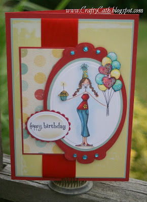
This is Partygirlabella. Doesn't she look awesome with her party hat, balloons and cupcake? The layout was pretty easy since it was supplied to us by Jodibella - as the challenge this week. I have to give more credit her way though, I also took inspiration from her birthday card here to Karenbella. I pulled the same color scheme incorporating older Cosmo Cricket design paper and a Tres Jolie scrap I had out on my desk. I had great fun coloring the balloons and adorning them with glittah! I had to stamp the image twice though and cut out the balloons on the second one to piece back once I cut the image out with an oval Nestie. You can hardly tell! Thank goodness I thought to stamp a couple of these before I sent Madison and McKenz their birthday package. I knew they wouldn't mind if I used their stamps first because they are always asking me to send them new images. Since I was already into a second image - I decided to pop the cupcake up on dimensionals.

Here's a closeup for you...


Most of you know that I stamped this on Neenah Classic Crest cardstock with Memento Tuxedo black ink. She is colored with copics and shaded with prismacolor pencils and gamsol. The senitment is also from Stamping Bella and I added VersaMagic Wheat chalk ink to shade the outer edges.

Little miss Mini-Bella McKenz also made a card this week. Now don't be shy about leaving her some love. She always checks out the blogaroo and would love to see your comments.


Enjoy the rest of your week.

Cath

Tuesday, June 22, 2010

Indulge Yourself!

Mo Manning images are so full of life and character! It used to be that you could only get her images digitally. I actually purchased my first digi stamps from her Digital Pencil Too store. If you haven't yet acquired any because you are unfamiliar about how to download you are in luck! You now have more options to Indulge Yourself! Mo's images can now be purchased in rubber form from Stamping Bella and in Photopolymer Clear Stamps from Stampavie. The clear stamps are very crisp and full of detail. Since Mary Maxim's carries the Stampavie brand, that is what I used here.


This is the image we will be coloring in our August Copic classes. Now don't get all excited about this card though - I haven't finished the layout for our class card. This is my practice run using papers from my stash along with Kraft cardstock so I could upload it for Jeanie's That's Krafty Thursday Challenge. You have until Wednesday night to link your creation up here. It's pretty easy, just submit a card using Kraft cardstock. Not so hard is it? Then give it a whirl - you just might be named this week's Krafty Chick. Don't you want a chance to display the cute Krafty Chick badge? Woo Hoo, then get going.

Of course you have probably guessed that this was stamped with Memento Tuxedo Black ink on Neenah Classic Crest paper and colored with Copics. Yup - my favorite combination. Then I added prismacolor pencils blended with gamsol to add shading around the image in Jade Green PC1021 and around the wand in Sand PC940. This also looked like it needed lots of glittering so I first used VersaMark Frost Dazzle on the wings and then topped it with Quickie Glue and Hero Arts Prisma Glitter. The wand was higlighted with a Sakura Gellyroll pen. I then pulled out a tool that I had yet to use but have had for 3 months now - Smootch Spritz in a frost shade. You have to be careful with this - the span is quite wide so it landed on all the papers I had on my work space. Oops! It also leaves splotches - notice the glob in her hair in this closeup.


Ok, my assessment is to use sparingly and practice but I like shiny things so I'll live with this.

The Indulge yourself sentiment came from a Deja Views 8x8 paper pack in shades of green and purple. I'm not really a purple fan but fairies just seem right being decked out in it. It also screams to be adorned in sheer ribbon as well. The piece I used here came from my stash of clearance ribbon from Mary Maxim last year. Soooo glad I kept going back. I have yards of this and it only cost me a $1.00. Some girls buy shoes - I have a fettish for ribbon and paper and copics and ... ok I love my papercrafting supplies more than clothes these days! But the sentiment says it all - Indulge Yourself! You'll feel better.

Hope your week is going well.

Cath

PS. I have not a clue what the DP is. It was a very fibrous paper with a silver pattern that I must have bought by the sheet. Heaven only knows from where though. It was in the stash and I've sworn to use more of my stash and hoard it less. See the DH saw me trying to buy some Basic Grey 6x6 paper packs online last week. He told me that I didn't need anymore. I told him he didn't NEED his beer. He told me that the difference with his beer was that he USED his beer and was entitled to get more. He said that I needed to use my paper up and THEN I could justify NEEDING more. Ok I see his logic (a little) but I want/need some more yummy paper. You just might see me posting more so I can use what I have up!

Monday, June 21, 2010

Graduation Wishes...

Tis the season for graduations and we have one in the family. My niece graduates from High School this week and we'll be heading back to NY to celebrate with her. I drew inspiration from her announcement to make her card more personal and extra special. Katie attended Fairport High and her school colors were red and white but the insignia on her announcement also had a hint of royal blue so I had an Ahhha moment.


I love royal blue, red and silver in combination so this was real easy for me. All the colors were in her announcement! I started with Bazzil cardstock, added some metallic silver paper and a red and white checker print design paper and floral print. Believe it or not the DP came from a Christmas pack by SEI called Winter Song. Mom and I went nuts to find it this past Christmas because it was full of soft blues and reds. Love it! I think Katie's graduation gown will be red but it looked much nicer to compliment my design papers if I did it in blue. So I compromised and added the red sash to tie it all together. I don't really think Katie will care that the gown isn't the right color. Do you?

As usual, I stamped Diplomabella from Stamping Bella on Neenah Classic Crest cardstock with Memento Tuxedo Black ink. I colored her with Copics and added shading with prismacolor pencils and gamsol to blend. I used Lindabella's tip of shading the outer edges with VersaMagic Wheat chalk ink.

Jeaniebella and Paulabella have been adding ribbon through loopholes on their iamge panels and I gave that a try. Love it! It "ties" it together instead of hiding behind the panel. Yum - thanks girls! One of my favorite parts of this card is the High School Insignia I added in a Nestibilitie classic circle.

Recycling more of the announcement I decorated the inside of the card with the pencil drawing of the school and the inspirational sentiment.


I hope that Katie takes more than one step to find her future!

Thanks for stopping by! I've got a few more things to show you this week so stop back in a day or two.

Cath

Sunday, June 20, 2010

Finding a calling...

Have you ever felt that you haven't quite found your niche? As the art of papercrafting has become a part of my life, I have often felt like I have tried many different styles. There's the oooohhh I have to have that and I wish I could do that. But once I was introduced to the internet (by Lizzie) and the world of blogging, a whole new set of options became available to me. Over the past year, the biggest influences have been the layout design of Amy Sheffer, Copic coloring by Linda Heavens and pencil coloring by Paula Williamson. I finally feel like I have found me! I now put all three of them into my cards and I am sooo happy with the results. It's like the feeling of coming home after a vacation and pulling down the sheets to spend a night in your own bed. Ahhh! Yeah, it's like that!

I spent lots of time this weekend in my haven! Which means that I have lots to show you this week. But with all the crafting, I struggled with the photos. Now I just wish that I had a superstar to help me take better pictures...Anne hope you can make time for me next weekend so I can finally learn how to use LightRoom.

On to the card, A Birthday Hi!


The stamp set is from Not So Short Notes, a 1997 Stampin Up! collection. I bought it on EBay ages ago when I first started to stamp. I didn't know a thing about Copics or pencils and gamsol at the time though. I was rummaging through my old stuff to see if I still wanted anything and came across these. Now that I have my passion to color, I set about bringing this to life.

I started with Neenah Classic Crest cardstock and inked with Memento Tuxedo Black (recently rejuevenated with the re-inkers that Mary Maxim now stocks - yeah!) I colored with my copics and shaded with prismacolor pencils blended with gamsol. I added clouds using Paula's technique here and grass which can be found on Splitcoast stampers. The sentiment is computer generated and cut out on one of the Nestabilities Tags 5. The flowers are also die cuts from Nestabilites called Flower Creations. I used Bazzil cardstock and layered them with a Zot. The brad is not really a brad but an upholstery tack that I had the DH clip the post off. I then attach them with Zots. You might ask why not just use a brad? Well, I get these real cheap with my employee discount at good 'ol LumberJack. There's also the bonus of having the DH feel needed too!

The design paper is from a Making Memories 6x6 pack called Poolside and Greenhouse. It's a collection of blues and greens. Yum. I also added some Stampin Up! Dazzling Diamonds glitter to the roses at the bottom. Click the picture to get a better looksy. The ribbon is single sinded satin so it took some manipulating to get it to lay right but Voila - it's done.

So what do you think?

Happy Father's Day everyone! Hope that means that you have places to go and people to see. The DH and I will be spending the day by ourselves since all the kidlets are scattered North and South.

Enjoy your day!

Cath

Wednesday, June 16, 2010

A Cluckin Good Ride!


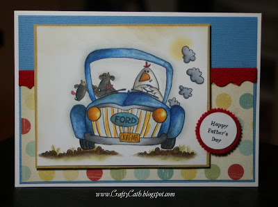
This Whipper Snapper stamp caught my eye...DH drives a Ford (all right it's big and white but I couldn't color an image white - this screamed to be colored) and you can usually see him with our two Rottie's Tank and Bella in tow. I knew it would make a perfect Father's Day card. I was inspired by my afternoon with Paula and Lizzy to finish this off. The base color was copics but I used lots of prismacolor pencils blended with gamsol to add shading and dimension. I had so much fun with this. If you look closely you can see Paula's signature grass (ok it's mine but inspired by hers). Since this was meant to mimic the gravel and grass at Goodells Park I only put a few clusters. Paula had a great idea to add the sun burst shining through the puffs of exhaust smoke. I would never have gone there - see it is worthwhile to sit with another crafter every now and then - they see things with a totally new eye.

Now onto the details...I stamped this with Memento Tuxedo black ink on Neenah Classic Crest Solar White paper. The first layer of color was copics and then I added shading with prismacolor pencils blended with gamsol. The papers are Bazzil, Tres Jolie, and Lasting Impression. There is a new felt craze so I added a red felt border I cut from a Tim Holtz Sizzix Die. After watching Lizzy create her Tim Holtz cards for her class at Remember when, I had a craving to incorporate some new dies I had into my creations. I generated the sentiment on my computer and backed it with another piece of felt that was cut out using the Nestabilities large pinking circles.

I'll try to post some pictures from our vacation a little later. The rain pretty much washed us out but we did still get some ride time in before we got drenched. I guess a bad day off is better than a good day at work anyday!

Have a great week. Thanks for stopping by.

Cath

Wednesday, June 9, 2010

Scrapnfonts

Today I'm going to share some information with you. I have been asked about the fonts I've used on my sentiments. Most of the specialties have come from Scrapnfonts. For a while they were offering freebies quite frequently. They still have 5 fonts for free which can be found in the lower right hand corner of the site. It's marked with a bright orange starburst and is titled "Free". Once you get into the freebies, just select the fonts that you would like to have. You will receive a zip file that you download onto your computer and place into your font directory.

I used the LD Going Nuts font on the sentiment of my King of the Jungle card. This happens to be one of the free fonts they offer right now. LD stands for Lettering Delights. I know that they have their own website now too that you can also find a large selection of fonts. Special offers come frequently from both sites and fonts are often $1 and many come bundled. Having stamped sayings is ok - but sometimes it's just not right. Having fonts on the computer allows me some freedom to personalize my sentiments so they are just right for my occasion.

Hope you find this little tidbit of information helpful. Have fun hunting for new fonts!

Cath

Sunday, June 6, 2010

The Places We'll Go

Another weekend has flown right by. I filled mine with lots of creatin time! Saturday started off with a Copic Class at Mary Maxim. We worked on the King of the Jungle card and everyone had a wonderful time even if coloring the mane gave everyone the heebie geebies. What I love most about the classes is what everyone brings to the table. Everyone interjects their own personality into the coloring. I love to see how each one changes the image just a little. We've completed four classes now and everyone is getting better and better with each one.

I had two special guests at class this week; Paulabella and Lizzy. We spent some time shopping in Mary Maxim and had fun looking at all the new products. Funny that you can recognize new things even after looking at the shelves dozens of times. New blood brings in new ideas and streches us beyond our experience. I love it! Got me some new glittah from Paula's suggestion and I am thrilled to be showing it to you in a bit. Now back to the day, we spent hours coloring and chatting and sharing ideas and it was a wonderful afternoon. After a wonderful dinner in Sarnia at Patty Flaherty's for some good Irish grub we settled back into some late creatin. We walked through the door about 12:30 am and Auggie chided me for keeping Miss Paula out so late/early. I know that when I hit the pillow I fell into a sound contented sleep. It was a great day.

After spending alot of timing watching Paula with her copics (yup you read that right - our pencil queen DOES know how to use Copics and as well as she knows her pencils) I couldn't wait to get at this card. Our great niece turned two this weekend and I needed to get her card done. Of course I used a Stamping Bella image but for those of you who recognize Mo - it is one of her first releases in rubbah. So with a renewed appreciation for my copics and what I could do with them, I set out to get 'er done.


This is Bye Bye Girl. I had inspiration from Linda Heavens, Paula Williamson and Mary Clark. I started with Neenah Classic Crest cardstock, Memento Tuxedo Black ink and my Copics. I did add some shading with Tim Holtz distress ink - after a tip from Paula - as well as prismacolor pencils. The design paper is Hope by Melissa Francis and K&Company Small Wonder Girl. The sentiment comes with the stamp and I stamped it on Kraft paper to tie in with the second layer of cardstock and allow me to link this up for Jeannie Bella's That's Krafty Thursday challenge. You have until Wednesday to add some Kraft paper to one of your creations and link it up as well. Why not try for the chance to be named this week's Krafty Chick?

Here's a closer look at the image and the sparkly glittah that I got. I forgot to add my black gloss to the ladybug in this picture but I'm tired and ready to head off to bed so you're just gonna have to imagine that ok?


I finished the card off with double sided satin ribbon, a Prima flower and Kaiser pearl.

I told our nephew that if he doesn't want to keep this card, he can call me up and I'll take her back - I just love her that much!

Have a great week.

Love ya,
Cath

Thursday, June 3, 2010

Bon Voyage Summer Travelers


Summer is on it's way. And it's the theme of this weeks Stamping Bella challenge.

Do you have plans for summer travel? The DH and I have two trips planned and our first one starts next week. We are taking our annual Motorcycle trip up to the Adirondak mountains in upstate NY. We'll be traveling with our best buds Tom and Angela and will enjoy good food, good cheer and beautiful countrysides. I can't wait!

The Bella Queen, Miss Emily, will be heading on vacation as well. Part of her trip is business but I'm sure she and hubby will find some time for pleasure as well. With a little stop in grand Paris I know that I would. So, with all this vacationitis, I pulled out Arivedercibella. Then I unearthed some American Traditions Design paper that I bought about 5 years ago (see you can find a use for everything if you wait long enough). It's called Tourist - Earthtones and I knew it would fit perfectly with my little world traveler. I lucked out more when I noticed that one of the postage stamps was for France and it showed an airplane and camera - perfect for Little Miss Emily's upcoming trip. If you look in the lower left corner you can see it. I also pulled out my new Big Scallop Oval Large Nesties - I love big scallops and was so glad Brenda from Mary Maxim was able to order them for me.

The sentiment was computer generated and shaded with Wheat VersaMagic chalk ink. A few Dew Drops,ribbon, and some stitching finish this off.

Hope you were able to participate and try for a chance to win some Bella Bucks. The twins and I haven't won one yet but we keep trying each week.

Enjoy the start of your weekend. I'll be preparing for a visit from the one and only PaulaBella. So excited to spend the day creatin and chillin out. Someone pinch me I must be dreaming.

See ya soon.
Cath

The sent

Wednesday, June 2, 2010

Prezzies for LuLu take 2


I couldn't resist to get my Copics out and color this Stampng Bella image again but in brighter, lighter colors. Don't get me wrong, I loved the olive shades I did last month but I wanted to give this a try again using shades of pink and blue. I like the way it came out, what do you think?

Of course, I colored this on Neenah Classic Crest Solar White paper with Memento Tuxedo Black ink using Copics. The design paper is a combination of Basic Gray and Me and My Big Ideas. The sentiment was computer generated.

I just finished my card for this weeks Stamping Bella challenge. You have until tomorrow night to make yours with the Here comes Summer theme and send it off to Emily. I'm heading on vacation next week as is Emily so mine was motivated by my vacationitis. Can't wait to share it with you. So stop back tomorrow...k?

Thanks for stoppin and see you soon.

Cath

Tuesday, June 1, 2010

Paper Dolls Anyone?


I don't know how much fun you had as a kid playing with paper dolls but I'll tell you, when I saw the QuickKutz Paper Dolls at the Kitchener Scrapfest - I was hooked. I spent some time one evening with my Mom and Aunt and we had a ball. I thought it was finally time that I shared these with you.

In each of these, I trimmed heads and legs so that the image would fit my card. I liked the way it reminded me of a mannequin that I got to dress and accessorize. Check out the necklace, bracelet and purse...What fun it was to decide how to dress each one up was.


Enjoy and have a great week.

Cath